Your Mac’s dock is probably a lot older than you think. It’s been a defining feature of the Mac experience since OS X 10.0, graduating from humble beginnings as part of the NeXTSTEP and OpenStep platforms of the 80s and 90s.
Unlike Microsoft’s Start menu, Apple’s dock hasn’t changed much in the last 20 years. That’s great, assuming you’re fond of Apple’s simplified approach to application management.
But if you’re not a fan of the dock in its current form, you can customize it or replace it with one of these apps.
1. uBar

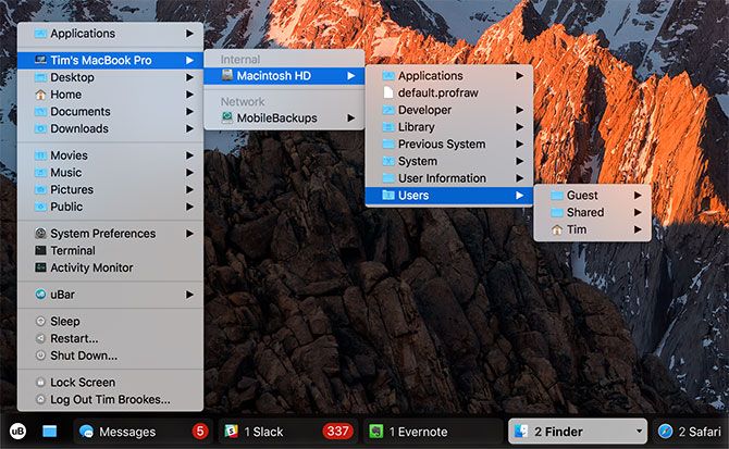
uBar is the premier dock replacement for macOS. Few other apps go this far in search of better macOS window management. Surprisingly, this is a feat largely achieved by mimicking the look and feel of Windows. You can configure the app as a Windows-like taskbar, or as a smarter version of the Mac dock.
The app defaults to a taskbar layout, placing all your open windows along the bottom of the screen. Apps are grouped together where relevant, making it easy to find anything even if it’s spread across multiple desktops. uBar lets you skip right to the relevant desktop with a click, and another click hides the app.
It also includes a small Start Menu equivalent, with expanded shortcuts to common folders, system preference panes, Terminal, and power options. You can heavily customize the app including adding your own shortcuts and toggling auto-hiding. It also lets you choose where it appears onscreen, change the color scheme, and exclude apps from appearing.
One of my favorite features is the inclusion of a month-view calendar when hovering over the date and time, something macOS doesn’t make easy unless you open Calendar. You’ll also find shortcuts to the Trash and a button that triggers the “expose desktop” gesture where you’d expect to find it on Windows.
Transitioning Windows users will find uBar a useful tool, though if you become too reliant on it you’ll likely never drop Microsoft’s methods. That’s not a problem though, as uBar is a refined and polished product that’s well worth the $30 entry fee. You’ll get a 14-day free trial when you download the app, but you’ll likely only need a few hours with the app to make your mind up.
uBar really feels like a part of macOS, and it works best if you heavily rely on Spotlight as a launcher and disable your old dock entirely.
Download: uBar ($30, 14-day free trial)
2. Station
Station is a dock replacement that uses a hierarchy of folders to organize items in any way you like. It’s more a customizable version of the current macOS dock than a complete revamp. It works best if you have a specific structure by which you like to organize your apps, documents, and frequently-used locations.
Station lets you organize anything you like in a series of nested folders. As an example, you could have a root-level folder titled Applications that contains expanded folders for categories like Adobe and Games. By grouping items in a logical manner, you’re less likely to waste time hunting around and ultimately be more productive.
Station also has the ability to launch all items in a single folder. If you have a set of applications you use for work (like Pages, Evernote, Spotify, etc.), you can quickly jump in by launching everything at once. Adding items to your Station is a case of dragging and dropping everything in place, a potentially time-consuming endeavor.
Unlike uBar, Station isn’t a macOS window manager. Running processes will not appear in Station; only shortcuts and folders you have created yourself show up. That means it might not function too well as a dock replacement, unless you’re going for a “less is more” approach.
A warning about the demo version: you will lose your folder hierarchies when you reload the app, and the app will forcibly quit an hour after you open it. This isn’t the greatest means of testing an app, since you’ll have to re-download and set everything up again if you decide to buy.
Download: Station Demo (Free with limitations)
Download: Station ($15)
3. DockShelf

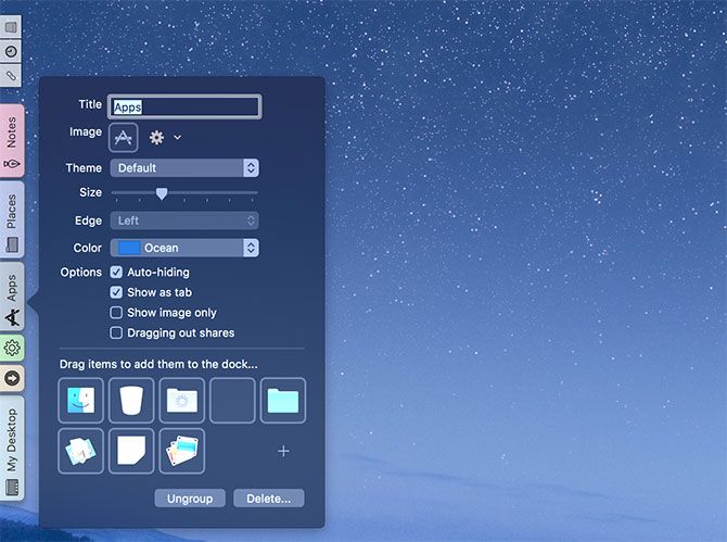
Sick of only having one dock? DockShelf lets you have as many docks as you like, containing whatever you want, in any position on your desktop. While it might sound cramped and impractical, DockShelf actually makes it pretty easy to keep a ton of icons close by.
By default, the app creates separate tabbed docks for your desktop, apps, places, notes, downloads, and recent files. You can choose to create new docks with their own purposes and icons, and populate them with applications, folders, stacks (popup groups), and even smart folders.
DockShelf can even create docks for running processes (like a taskbar). This lets you switch between apps or terminate processes with a right-click, as well as access external devices like USB drives. There’s even a “desktop” dock which acts as a scratch pad for any files and folders you want to keep within reach.
These docks don’t take up much screen space since they’re tabbed. Thus, you’ll need to hover or click on the tab in order to access the items within. It looks a little basic, but everything seems to work fine. The app could do with an update, but provided you’re running macOS 10.8 or later it should work fine.
The free version of DockShelf displays a splash screen on startup and places a big unsightly “Purchase!” link in your menu bar. There are no time restraints or other limitations that I could see.
Download: DockShelf ($5, Free trial with limitations)
What’s Up, Mac Dock?
Whichever dock you decide to use, getting the most out of Spotlight is probably the best way to increase productivity on your Mac. If you’re coming from Windows, don’t forget to check out our Mac 101 guide for Windows users.
from MakeUseOf https://ift.tt/2F2avLB
via IFTTT
0 comments:
Post a Comment